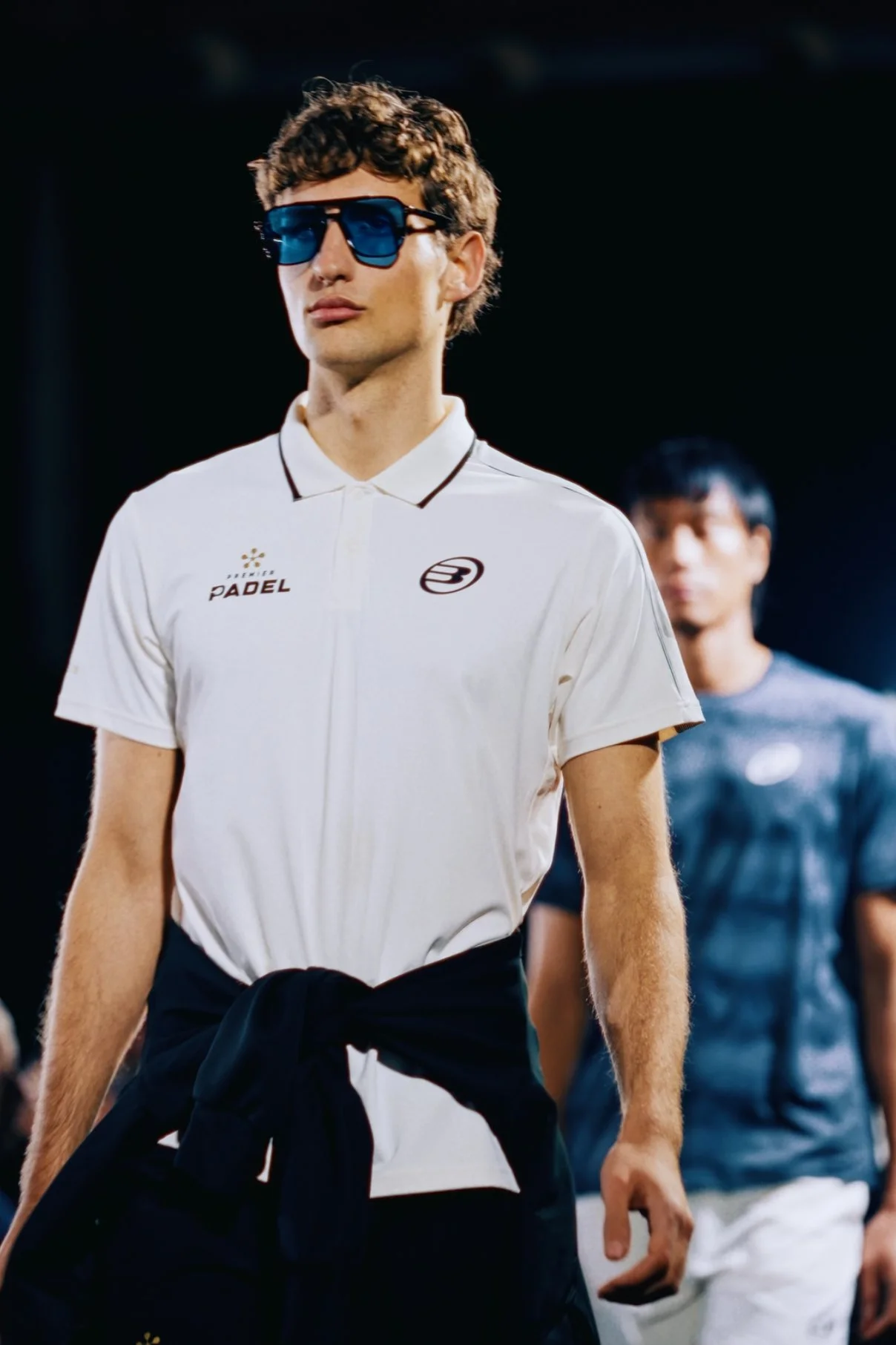
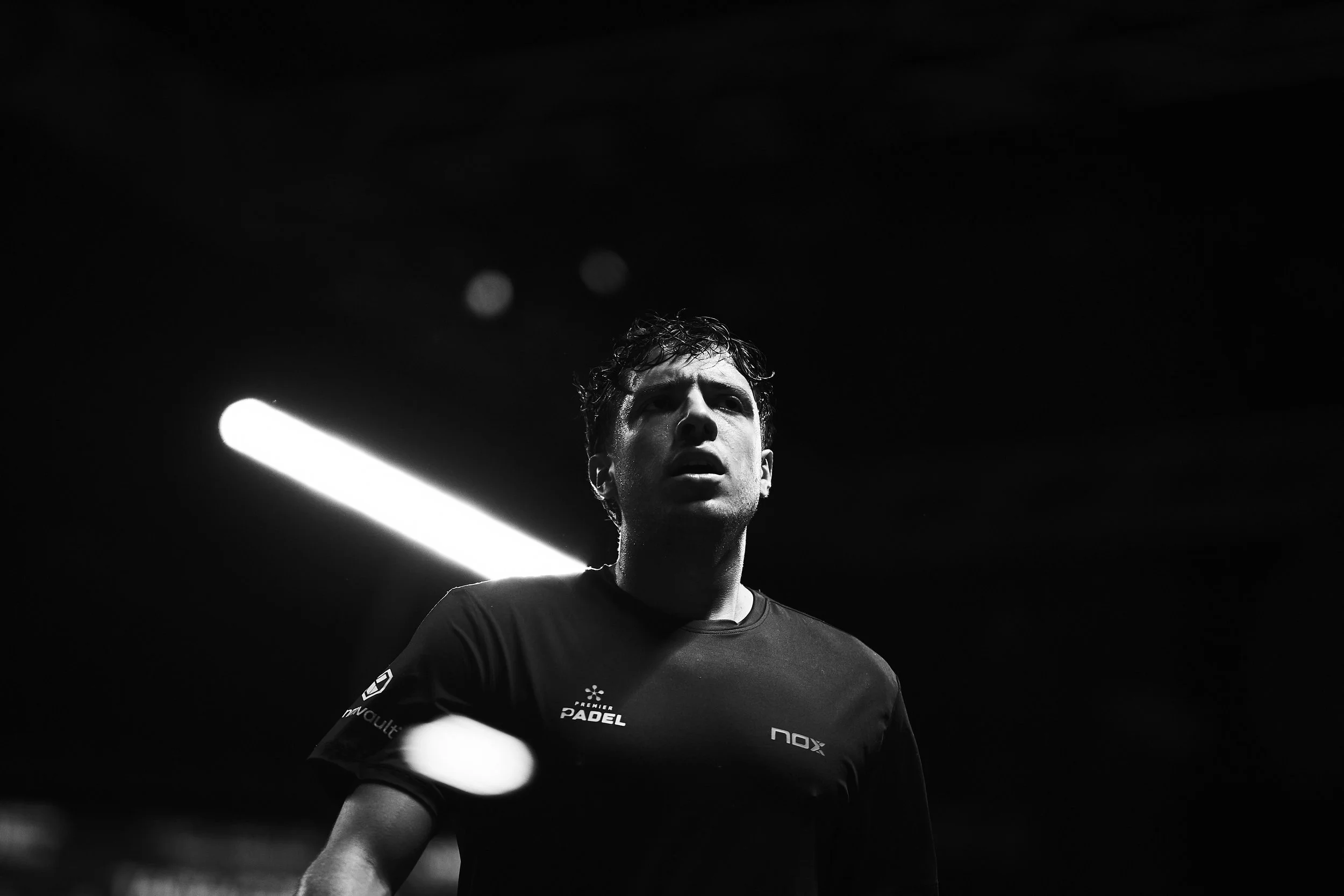
Premier Padel — Brand Identity + Guidelines
To design a brand identity for the official global Padel Tour — one that feels clear, distinctive and able to hold its shape across a rapidly growing international stage.
The Solution
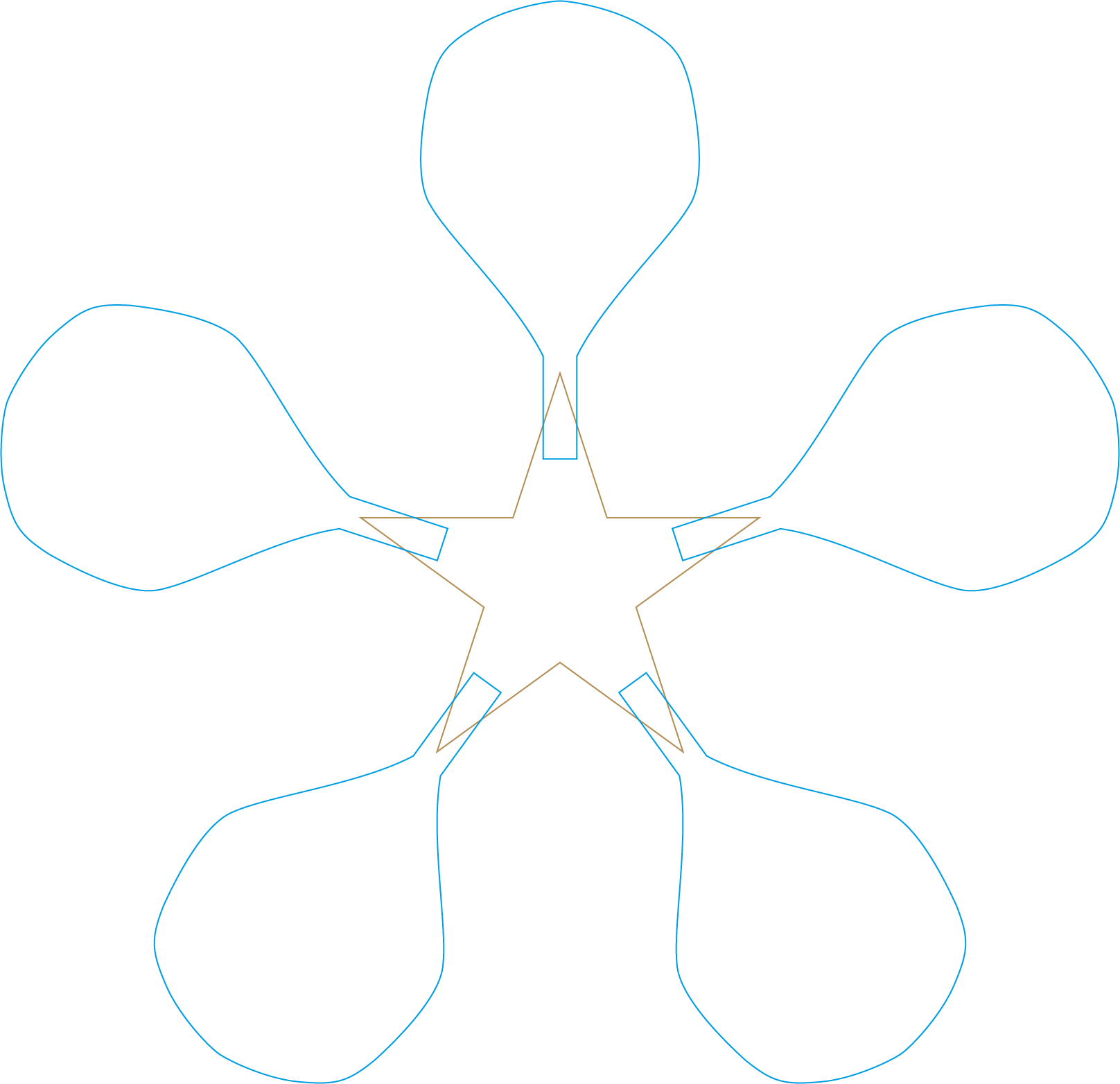
Using the form of the Padel bat, the identity was built around a five-point structure, referencing the global nature of the tour. Alongside this, a ‘P’ mark was developed, integrating the bat shape into a more compact symbol. This dual approach allows the brand to scale with confidence across formats and applications. Since launch, Premier Padel has grown rapidly, reaching over 1.7 million followers worldwide.
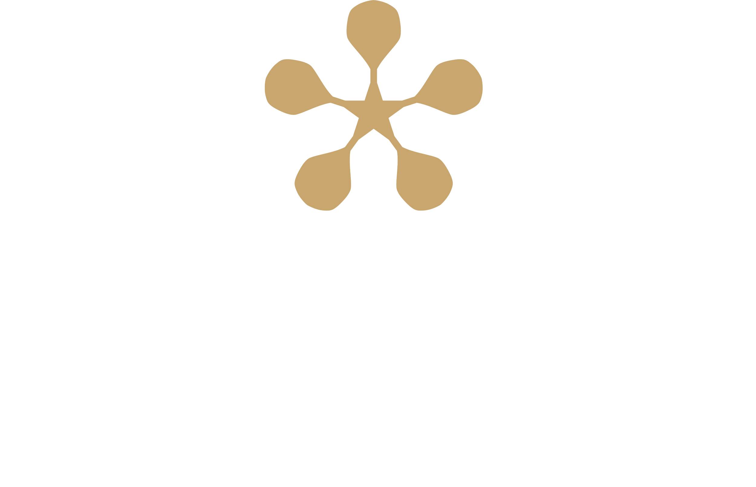
The Padel Star Icon

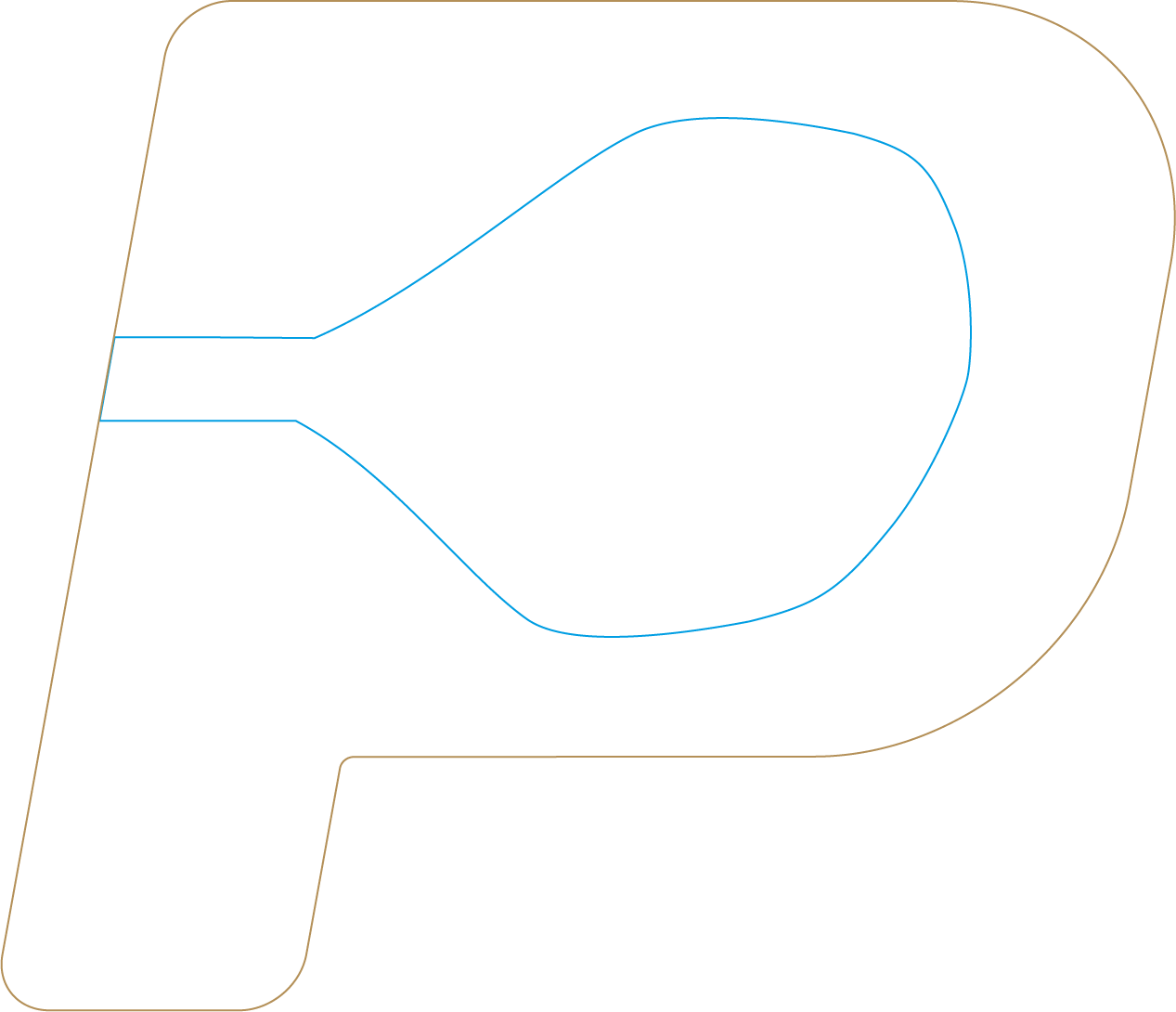
The ‘P’ Icon

The Result
The identity balances energy with control. Clarity and restraint guide the approach — resulting in a mark that is confident, adaptable and built to last. A brand designed to hold its shape over time.