Refinery — Brand Identity + Advertising
To create a distinctive identity for a hospitality space combining coffee and cocktails — one that feels considered, premium and able to move seamlessly between day and night.
The Solution
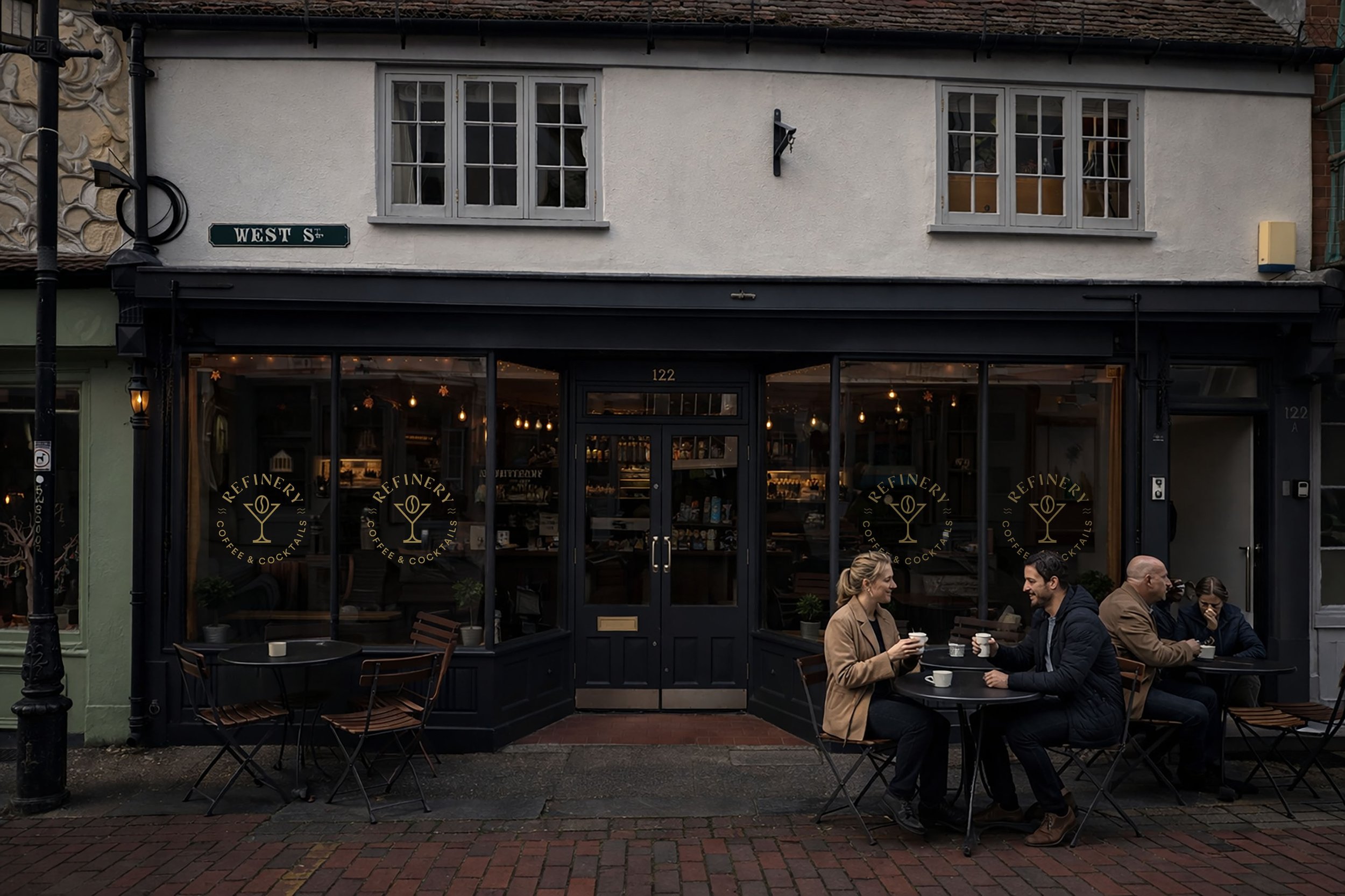
The identity was developed around a refined circular marque, creating a clear and recognisable presence across physical and digital touchpoints. A central symbol combines the language of coffee and cocktails into a single, balanced mark, supported by a restrained typographic system. The result is a cohesive identity that translates effortlessly across signage, menus and environment.
The Refinery Logo
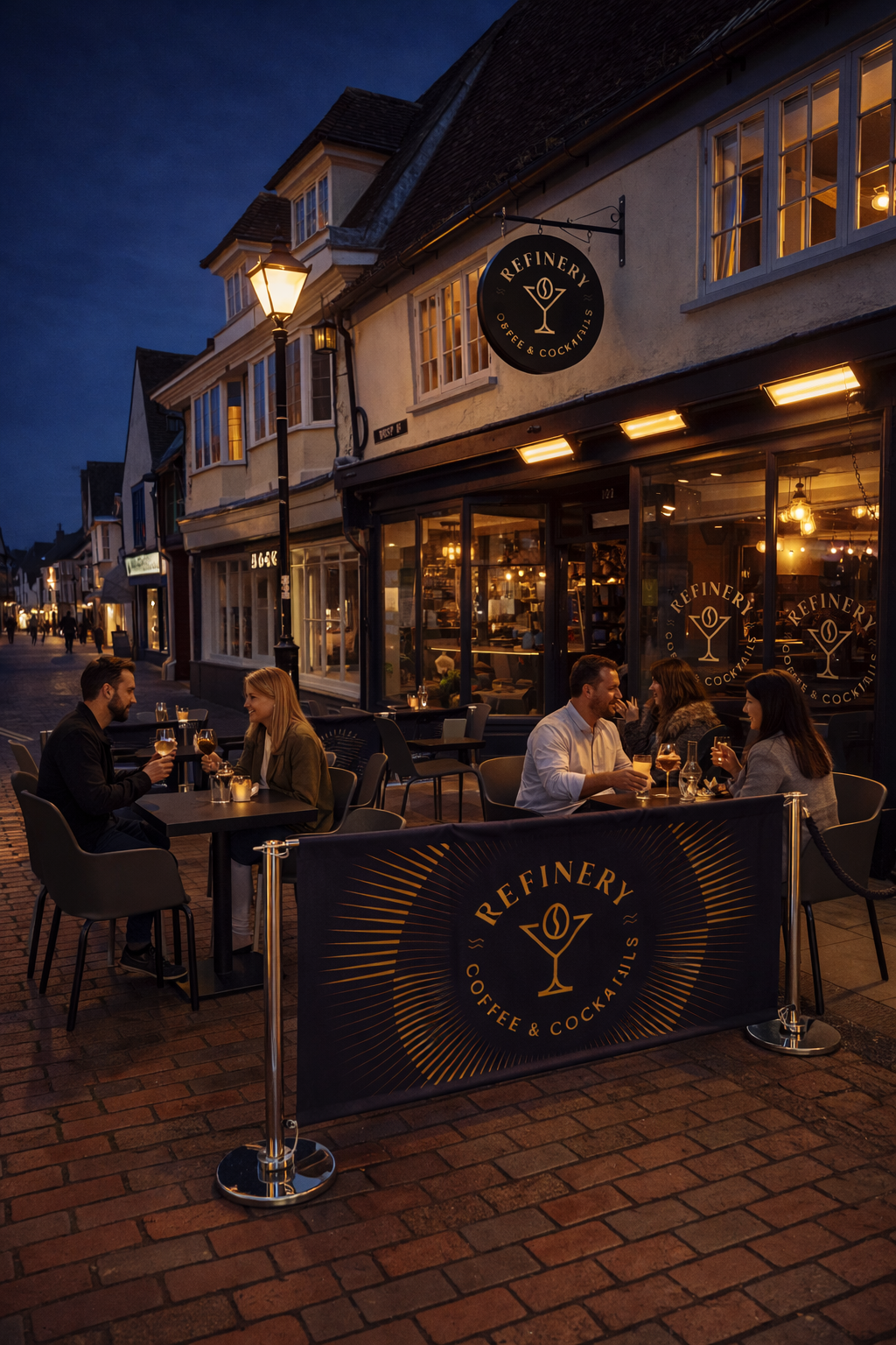
The Refinery rebrand is built around a simple idea: a place that moves with the rhythm of the day. In the morning, it’s about great coffee, conversation, and the quiet energy that starts the day. As evening arrives, the space evolves into something richer and more atmospheric; cocktails, connection, and the buzz of a sociable night.
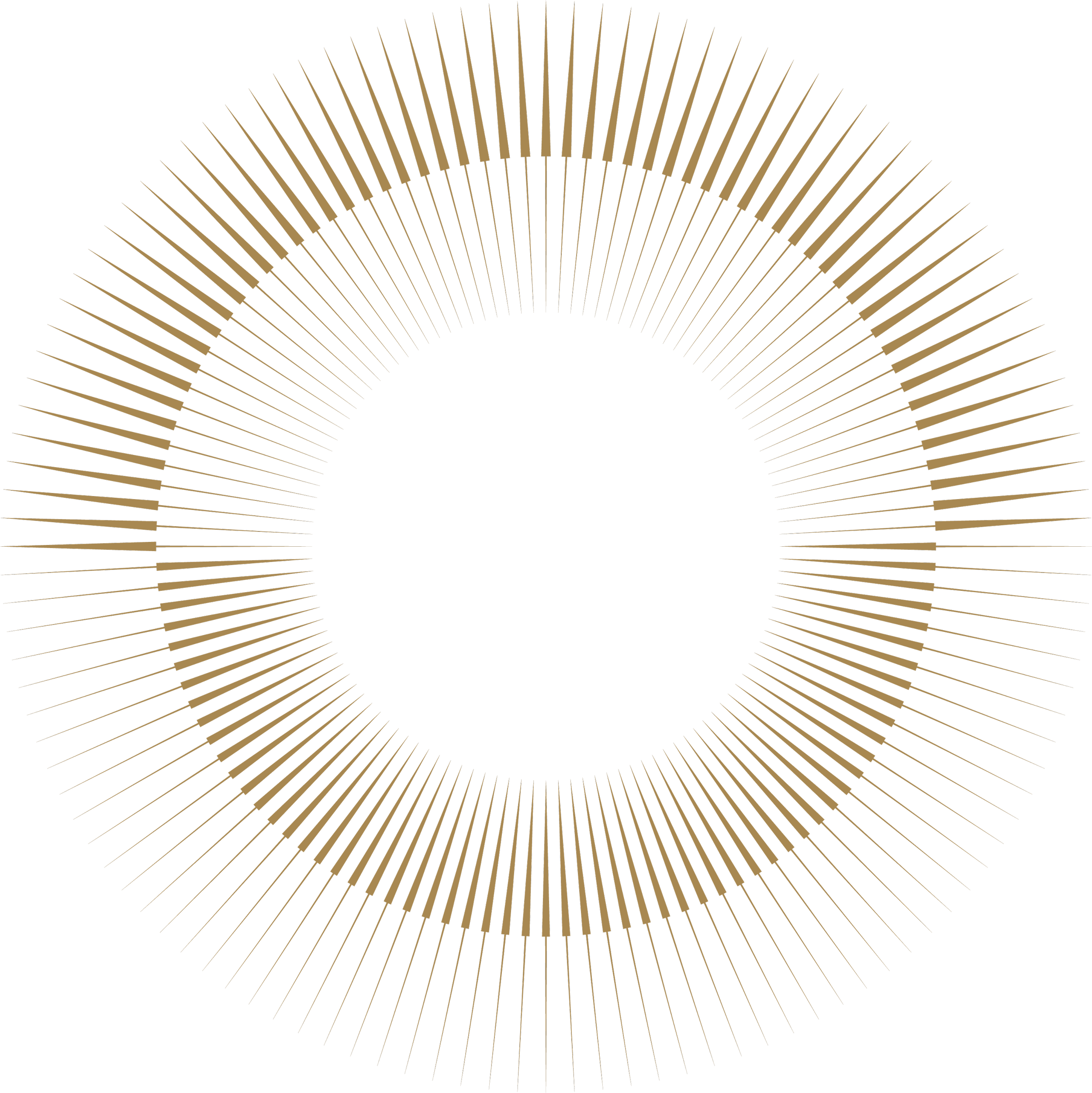
The Time Motif
Formed as a circular burst of radiating lines, the motif echoes the shape of both a rising sun and a setting sun, symbolising the passing of time. It reflects the daily cycle that defines Refinery; the shift from morning coffee to evening cocktails, from calm beginnings to lively nights.
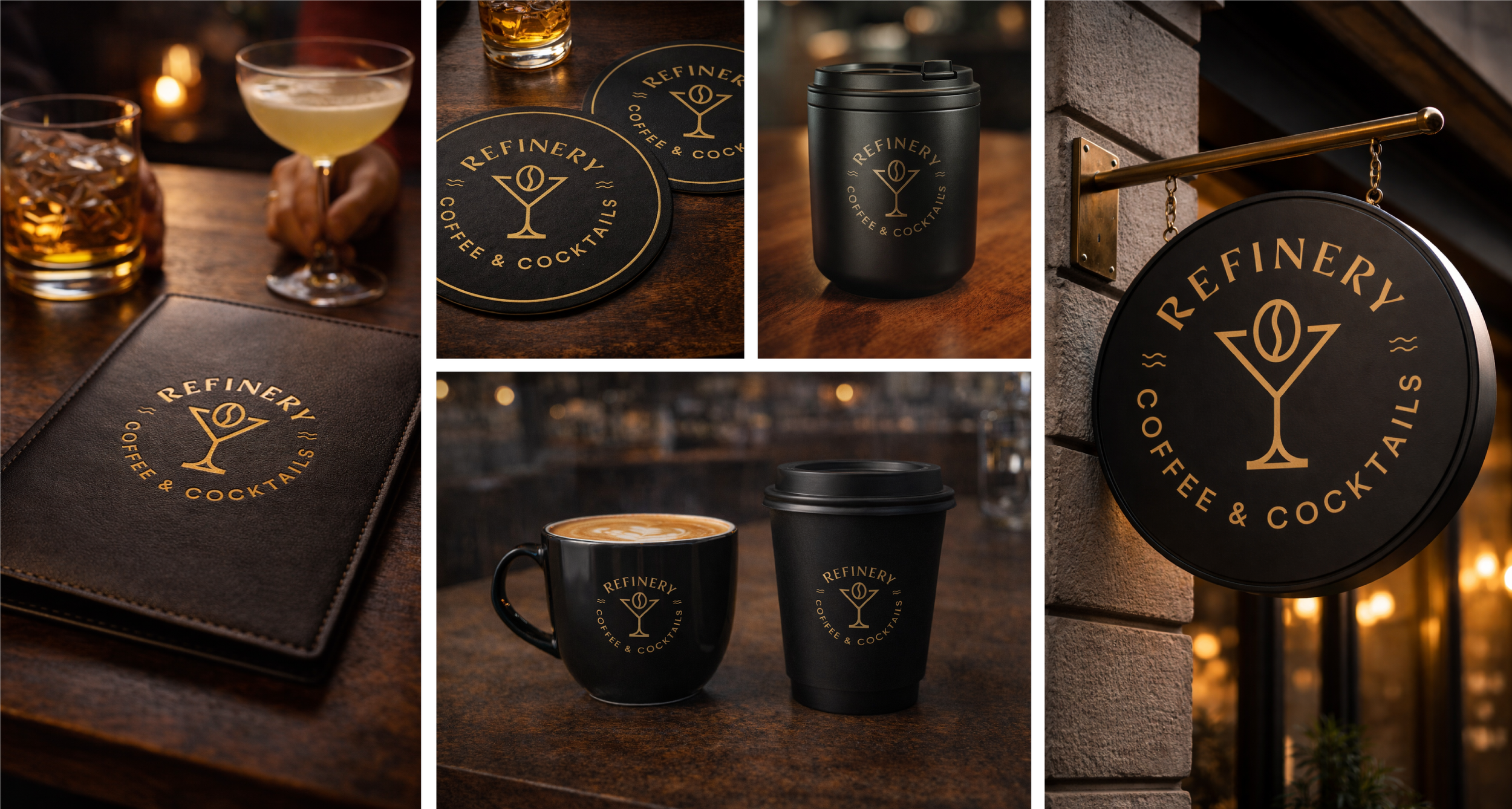

The R in the Refinery wordmark has a subtle twist: a flowing curve in the stem adds movement and character. It signals Refinery’s blend of tradition and creativity, from coffee by day to cocktails by night, and quietly reinforces craft, rhythm, and refinement.
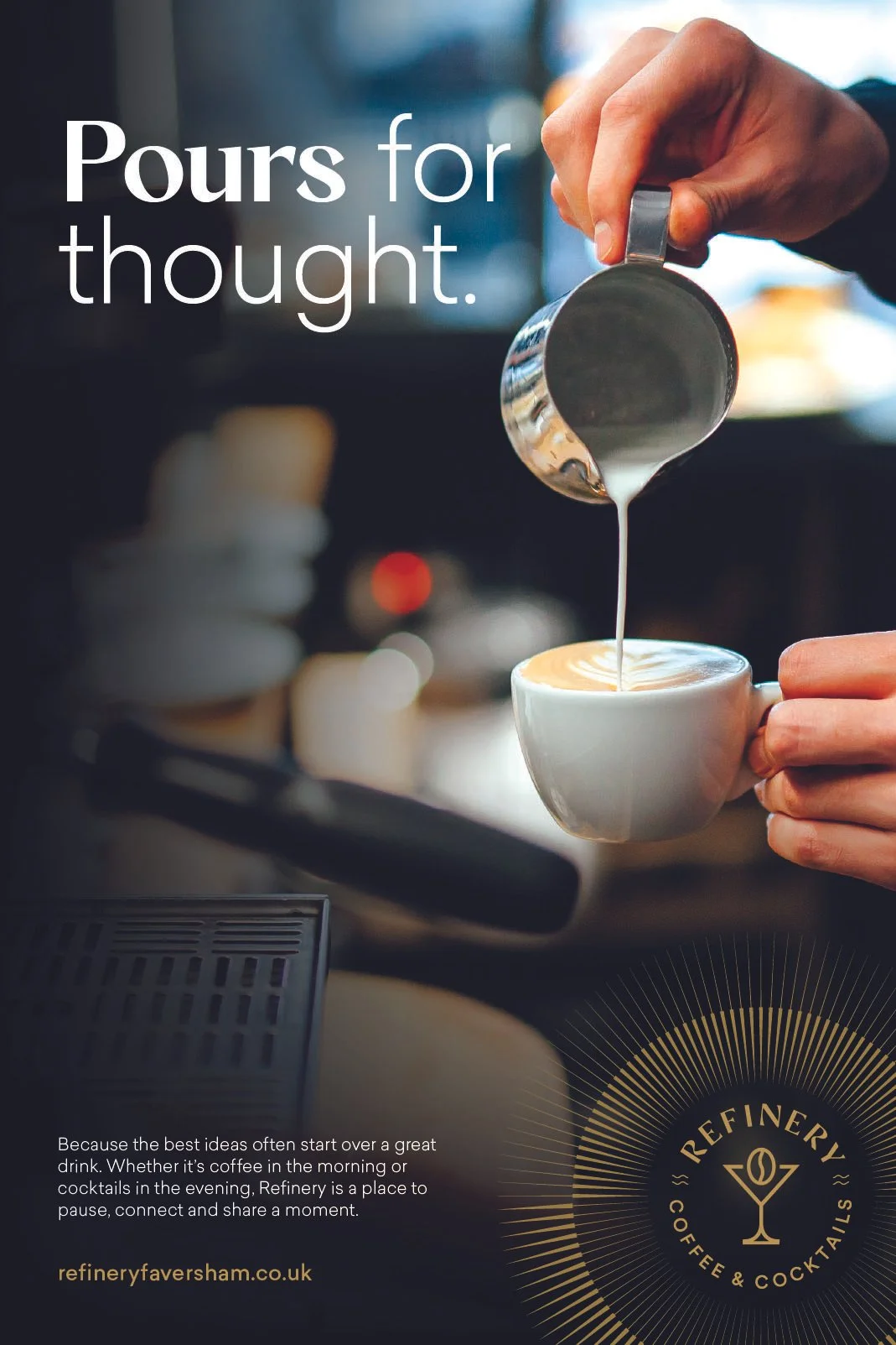
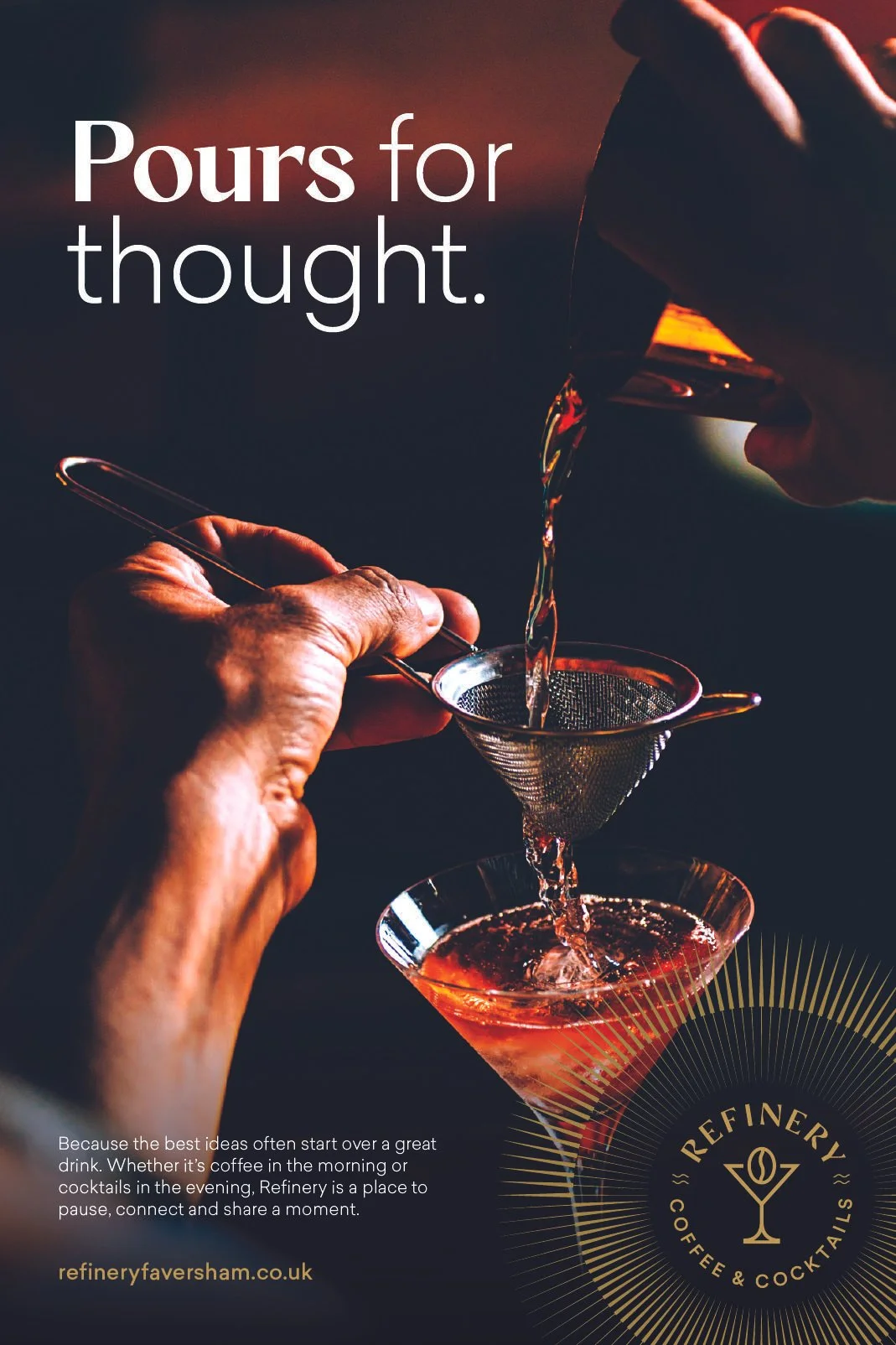
Advertising
‘Pours for Thought’ captures Refinery as a place where drinks spark conversation—morning espresso or evening cocktail—celebrating moments of connection, creativity and community over a perfectly poured drink.
The Result
The identity balances warmth with precision.
Clarity and restraint guide the approach — resulting in a brand that feels confident, adaptable and grounded in its setting. A graphic system designed to hold its character across every moment of the day.